Sidebar
A composable, themeable and customizable sidebar component.
Sidebars are one of the most complex components to build. They are central to any application and often contain a lot of moving parts.
I don't like building sidebars. So I built 30+ of them. All kinds of configurations. Then I extracted the core components into Sidebar*.vue.
We now have a solid foundation to build on top of. Composable. Themeable. Customizable.
Installation
install this component
npx shadcn-vue@latest add sidebarAdd the following colors to your CSS file
The command above should install the colors for you. If not, copy and paste the following in your CSS file.
@layer base {
  :root {
    --sidebar-background: 0 0% 98%;
    --sidebar-foreground: 240 5.3% 26.1%;
    --sidebar-primary: 240 5.9% 10%;
    --sidebar-primary-foreground: 0 0% 98%;
    --sidebar-accent: 240 4.8% 95.9%;
    --sidebar-accent-foreground: 240 5.9% 10%;
    --sidebar-border: 220 13% 91%;
    --sidebar-ring: 217.2 91.2% 59.8%;
 }

  .dark {
    --sidebar-background: 240 5.9% 10%;
    --sidebar-foreground: 240 4.8% 95.9%;
    --sidebar-primary: 224.3 76.3% 48%;
    --sidebar-primary-foreground: 0 0% 100%;
    --sidebar-accent: 240 3.7% 15.9%;
    --sidebar-accent-foreground: 240 4.8% 95.9%;
    --sidebar-border: 240 3.7% 15.9%;
    --sidebar-ring: 217.2 91.2% 59.8%;
  }
}
Structure
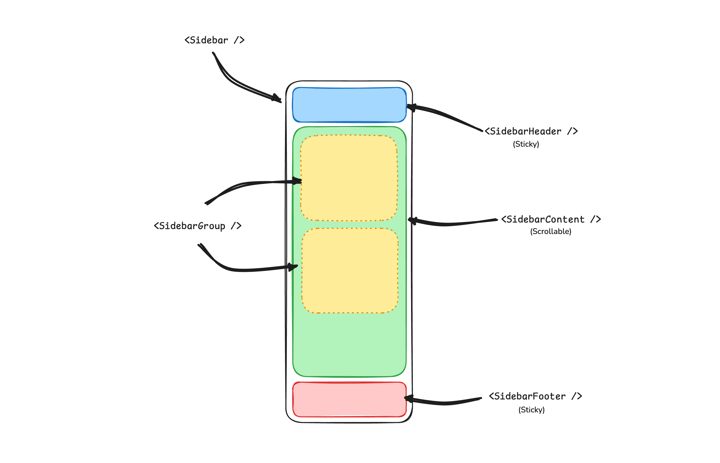
A Sidebar component is composed of the following parts:
SidebarProvider- Handles collapsible state.Sidebar- The sidebar container.SidebarHeaderand SidebarFooter - Sticky at the top and bottom of the sidebar.SidebarContent- Scrollable content.SidebarGroup- Section within the SidebarContent.SidebarTrigger- Trigger for the Sidebar.
Usage
<script setup lang="ts">
import AppSidebar from '@/components/AppSidebar.vue'
import { SidebarProvider, SidebarTrigger } from '@/components/ui/sidebar'
</script>

<template>
  <SidebarProvider>
    <AppSidebar />
    <main>
      <SidebarTrigger />
      <RouterView />
    </main>
  </SidebarProvider>
</template><script setup lang="ts">
import {
Sidebar,
SidebarContent,
SidebarFooter,
SidebarGroup,
SidebarHeader,
} from '@/components/ui/sidebar'
</script>
<template>
<Sidebar>
<SidebarHeader />
<SidebarContent>
<SidebarGroup />
<SidebarGroup />
</SidebarContent>
<SidebarFooter />
</Sidebar>
</template>Components
The components in sidebar are built to be composable i.e you build your sidebar by putting the provided components together. They also compose well with other shadcn/ui components such as DropdownMenu, Collapsible or Dialog etc.
If you need to change the code in sidebar, you are encouraged to do so. The code is yours. Use sidebar.vue as a starting point and build your own.
In blocks the title has Sidebar you can see how it is used.